Is Mississippi flattening the curve? Take a look at these new state coronavirus graphs
As Mississippi sees more new COVID-19 cases and deaths, tracking the spread across the state is important for the public to see.
These graphs below are meant to help with that. They are interactive, meaning you can hover over them and see data points dating back to when Mississippi reported its first new coronavirus cases in March.
These graphs use data reported by the Mississippi State Department of Health. They will update once a day.
New cases and seven-day average
The above graph tracks the number of new coronavirus cases and a seven-day average of new cases.
The number of new cases each day is found by subtracting the total number of cases reported on this day from the number of cases reported the day before.
The seven-day average is found by adding the number of new cases reported each day and dividing by the number of days in a week. This average, called a simple moving average, can help identify trends that are hard to find.
New deaths
This graph shows the number of new deaths reported each day in Mississippi since March.
Total cases
This graph shows the number of total cases reported in Mississippi since mid-March.
Total deaths
This graph shows the number of total coronavirus deaths reported in Mississippi since late March.
Total number of cases on the Coast
This graph shows the total number of coronavirus cases along the Coast since March.
Long-term care deaths compared to other deaths
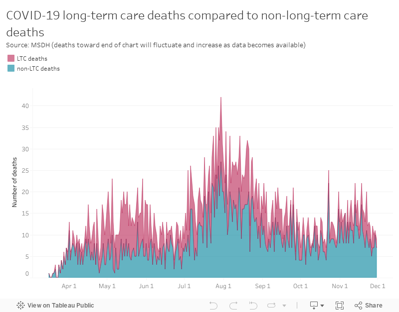
This graph by Mississippi Today shows the number of COVID-19 deaths in long-term care facilities, like nursing homes, compared to other deaths.
This story was originally published May 21, 2020 at 5:45 AM.